Pantone, the leader in color matching for designers and graphic artists, has created a color forecasting system that can help customers choose trendy or new colors. Keep in mind that color forecasting is a guideline to help the consumers coordinate and create a beautiful space; popular colors may vary in different regions. However, if you’re interested in using a forecasted color—or any other color—in your home, speak with a trained consultant at Windows & More. We’ll be happy to help you understand the new shades and help you determine if they’re right for your space.
More on Pantone and Their Color Matching System (PMS)
 Pantone established the first color matching system, referred to as the Pantone Matching system or simply PMS system, in 1963. It helps ensure consistent color selection every time. Today, Pantone is the main reference tool for all industries when they work to match colors and forecasted hues. The PMS system uses a standardized Pantone numbering system to identify each color (for example, Pantone Red 199), making it easy for anyone to refer to a specific color.
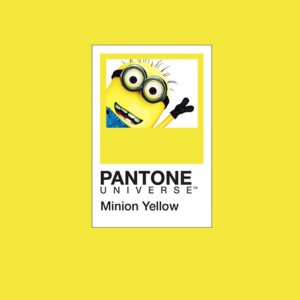
Enter Minion Yellow
For the first time ever, Pantone color system has been inspired by characters from popular entertainment. In this case, the color is Minion Yellow, based on the playful Minions from Universal Pictures and Illumination Entertainment’s Despicable Me franchise. The custom Pantone Minion Yellow color will be included in the next color addition in the Fashion, Home+ Interiors color palette.
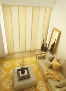
Using Minion Yellow
 Here are some tips to get the most out of this vibrant color (or any other!):
- When selecting colors for your room, go with the colors you love. Trendy colors come and go, and unless you have tons of money, you should choose what you love and not what you feel you need just because it’s stylish.
- Combine Minion Yellow with a complementary color for an exciting effect. For example combine it purple for one look or achromatic brown for a different one altogether.
- If you want to use three colors, use a blend of 60%-30%-10% to make sure you don’t create competition of color. A soft look would be a brown room, with yellow as the 30% and purple as the 10% accent color. Or play with it to create the look and feel you want.
- For more colors, try yellow, indigo, magenta, and black, creating a split complementary combination and a dramatic look.
Using Pantone Forecasted Colors in your Home in the Lake Ozark Area
Windows & More proudly serves Lake Ozark, Osage Beach & Camden, Miller & Morgan counties, with a showroom in Osage Beach. Contact us for a window treatment consultation!